Empathy Map Template
Dig deeper into your customer's mind with the empathy map template. Visualize all your user needs and develop products people will love.
Trusted by 65M+ users and leading companies


About the Empathy Map template
Many businesses and organizations have created an empathy map template to help them understand their audiences, users, and customers. It’s a great tool to gain insights and develop personas or customer segments.
What is an empathy map?
Empathy maps are visualization tools that allow you to articulate what you know about specific types of users. They are often considered a part of the design thinking methodology, and they empower you to create a shared understanding of user needs and help decision-makers with key judgment calls.
One good empathy map example is how UX professionals use it. They must create products beneficial to users they have never met or interacted with. To do so, it’s important to understand their users and help their colleagues do the same, so an empathy map is a powerful tool that helps them do both.
Benefits of empathy mapping
Many businesses employ empathy mapping as part of the design process because it’s helpful in understanding your users, their desires, and what they want out of your product.
Put a narrative to your data
The basis of empathy mapping is typically some firsthand data received from users that describe their thoughts on using the product. One of the major benefits of empathy mapping is that it requires you to tease out more about the customer from this data, determine what they’re feeling, and create a narrative that informs the rest of your UX & UI design.
Get inside the heads of your users
Empathy maps are also a useful exercise because they force you to put yourself in the shoes of your users and determine how they approach and interact with your product. It’s easy for designers to lose sight of real-world user experience with the product, so empathy maps help keep you grounded.
Easily visualize customer needs
Another benefit of empathy mapping is that it’s a visual exercise that distills various pieces of information about the customer experience into a single reference point. Empathy maps can be used and referenced by different stakeholders and team members at various points of the development cycle, and they’re relatively simple to create.
When to use an empathy map
Empathy maps are highly useful whenever your team needs a greater understanding of user needs, such as collaborating on user personas, and building the “user” in your user story.
Empathy maps help you sketch out profiles for a user or persona. They distill your knowledge into a single source of truth. An empathy map can help you summarize and analyze qualitative research such as survey responses and interview transcripts. By putting this information on a single page, you can uncover gaps in your knowledge and figure out how to fill them. Empathy maps are easy-to-use and digestible methods to illustrate user attitudes and behaviors.
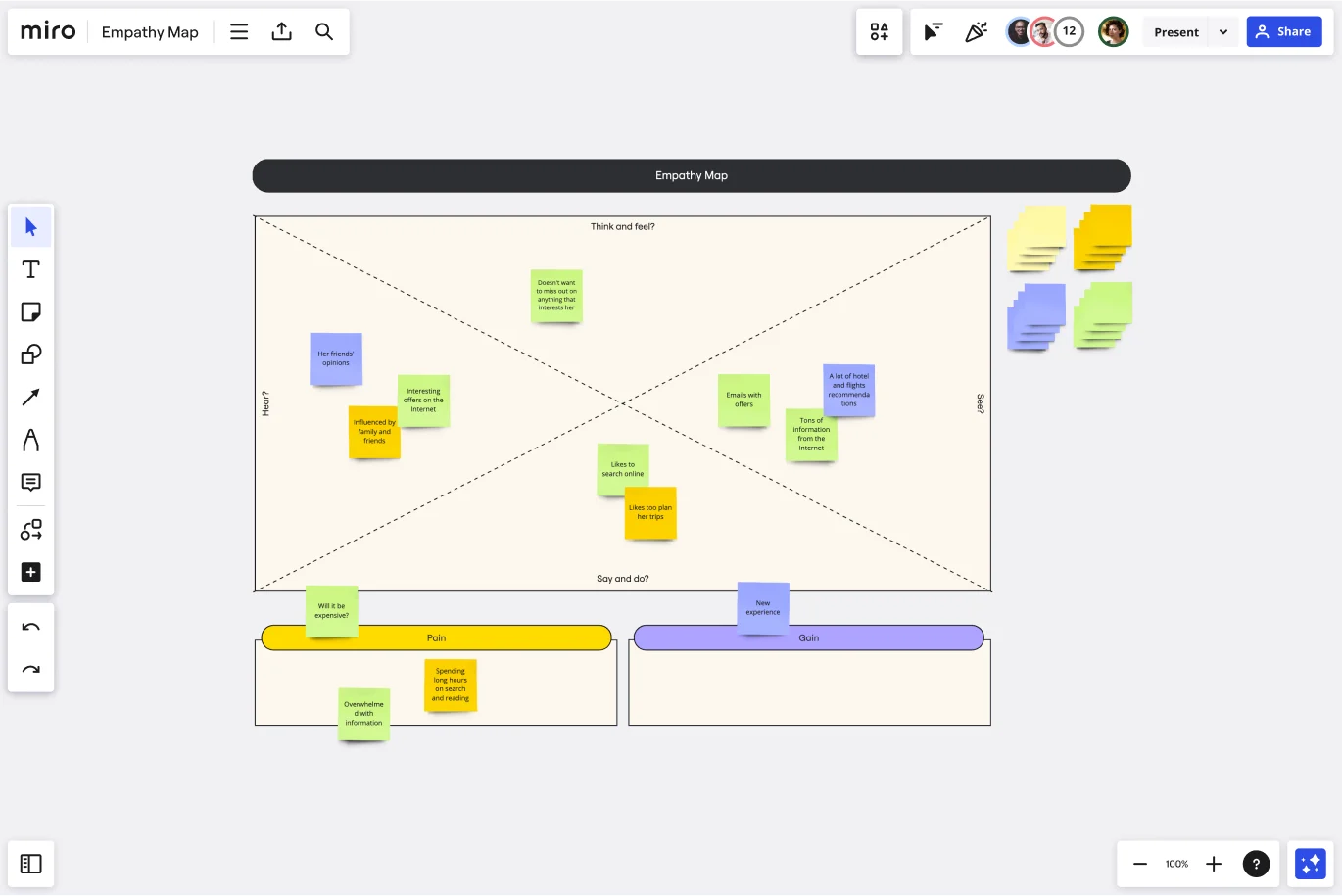
The 4 elements of an empathy map
Empathy maps are divided up into four quadrants.
1. Says
The Says quadrant records what a user says during an interview. Try to capture exact quotes, such as, “I use this product every day because it helps me streamline my workflow.”
2. Thinks
In contrast, the Thinks quadrant summarizes what the user is thinking throughout the experience. Based on your qualitative research, ask yourself what occupies the user’s thoughts, what matters to them, and what challenges they’re facing. The key here is to uncover the things they might be too shy or reluctant to share. For example, “This feature is really irritating.”
3. Does
Like the name implies, the Does quadrant captures the actions the user takes. For example, if you’re watching a user interact with a product, you could record the following: “Keeps refreshing the page.”
4. Feels
The Feels quadrant records user emotions. What worries them? What excites them? For example, “The user is excited about the price point. The user is worried that this is too hard to use.”
Create your own
Miro is the perfect workspace to create and share your empathy map. Get started by selecting this empathy map template. Then fill the four quadrants discussed above and brainstorm different points to add to each section via sticky notes based on the initial customer statement. Or, if you wish, you can create your own empathy map example from scratch, using our diagramming and collaborative features.
Why are empathy maps important?
Empathy maps are important because they give designers an avenue into the mind of the customer and help them empathize with their experience, desires, and needs. They’re also useful for taking insights you gain from user research, digging deeper, and applying them to find concrete solutions.
How do you use persona empathy mapping?
To create an empathy map, start with a direct statement from a customer gleaned from user interviews or direct feedback. From there, you create a constellation of thoughts, feelings, and actions that underly the customer’s statement and help you understand why they made the statement and what their underlying motivations are.
How do I create and use an empathy map of my target audience?
You can create an empathy map by conducting user interviews and filling the empathy map template collecting data about how your customers feel about either your product or service. Ideally, it would be best to do an empathy map with your target audience to have data about who they are and how they interact with your product. People use the empathy map to improve product features and discover where the product or service falls short.
Get started with this template right now.
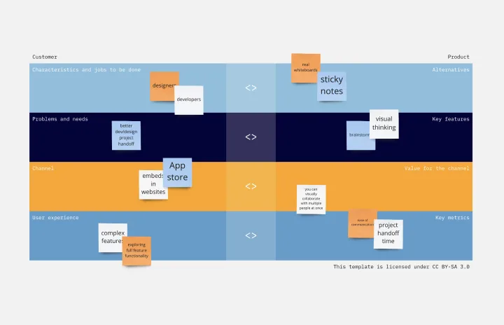
Product / Market Fit Canvas Template
Works best for:
Market Research, Strategic Planning, Product Management
The product/market fit canvas template is used to help product teams meet customer and market needs with their product design. This template looks at a product in two dimensions: first, how the product fits user needs, and second, how the fully designed product fits within the market landscape. This combined metric understands a product holistically from the way customers use and desire a product, to the market demand. By comparing customer and product qualities side by side, users should better understand their product space and key metrics.
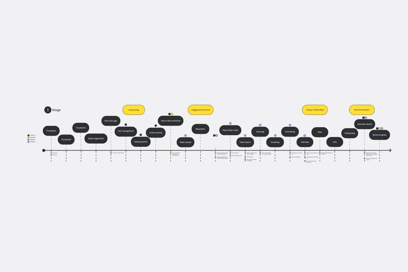
Customer Touchpoint Map Template
Works best for:
Desk Research, Product Management, Mapping
To attract and keep loyal customers, you have to truly start to understand them—their pain point, wants, and needs. A customer touchpoint map helps you gain that understanding by visualizing the path your customers follow, from signing up for a service, to using your site, to buying your product. And because no two customers are exactly alike, a CJM lets you plot out multiple pathways through your product. Soon you’ll be able to anticipate those pathways and satisfy your customers at every step.
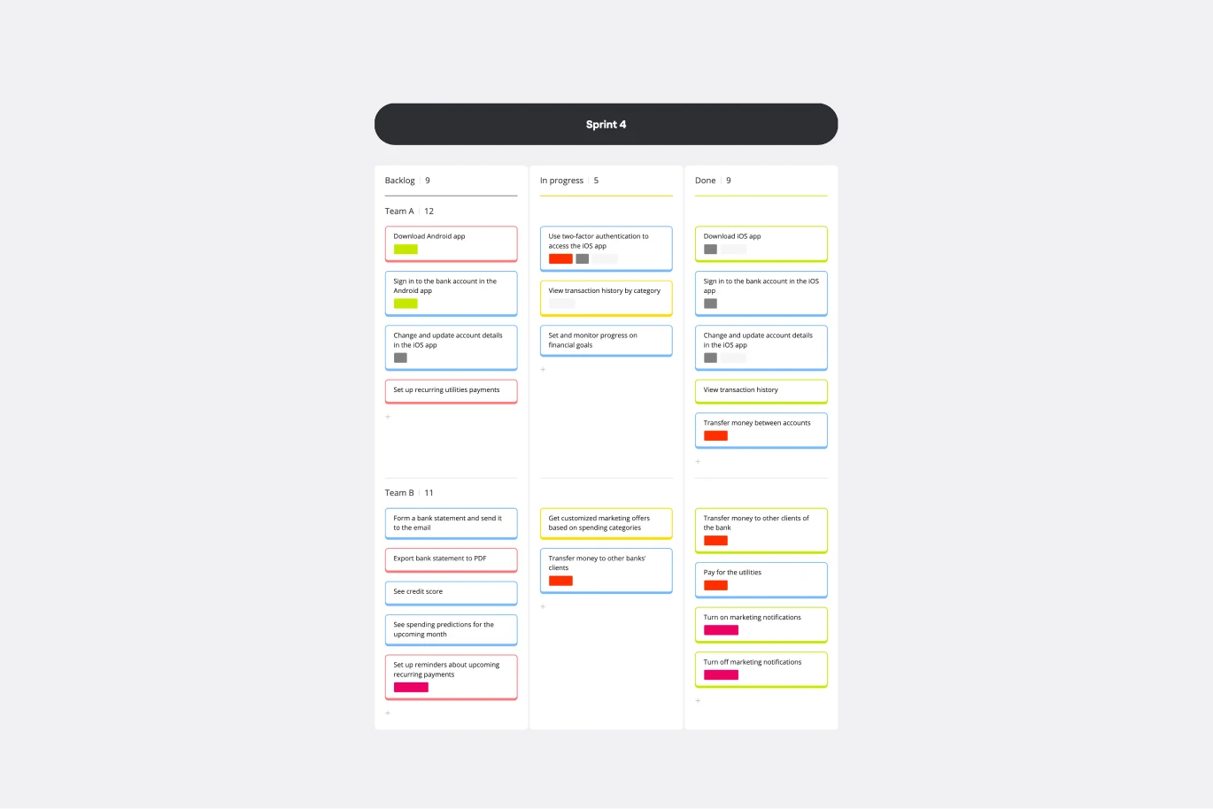
Kanban Framework Template
Works best for:
Kanban Boards, Agile Methodology, Agile Workflows
Optimized processes, improved flow, and increased value for your customers — that’s what the Kanban method can help you achieve. Based on a set of lean principles and practices (and created in the 1950s by a Toyota Automotive employee), Kanban helps your team reduce waste, address numerous other issues, and collaborate on fixing them together. You can use our simple Kanban template to both closely monitor the progress of all work and to display work to yourself and cross-functional partners, so that the behind-the-scenes nature of software is revealed.
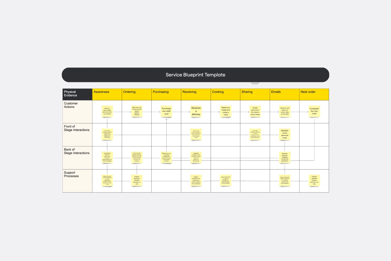
Service Blueprint Template
Works best for:
Desk Research, Operations, Market Research
First introduced by G. Lynn Shostack in 1984, service blueprints allow you to visualize the steps that go into a service process from the customer’s perspective. Service blueprints are useful tools for understanding and designing a service experience – and finding ways to improve it. Service blueprint diagrams make it simpler for teams to design new processes or improve existing ones. To create a service blueprint, map out each process and actor that contributes to the customer experience, from in-house contributors to third-party vendors.
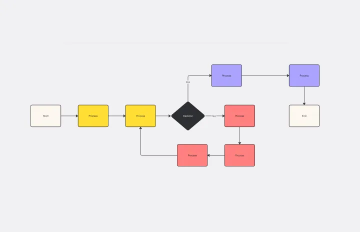
Flowchart Template
Works best for:
Flowcharts, Mapping, Diagrams
Trying to explain a process or workflow to your team — or just wrap your head around it yourself? Sometimes the best way is to see it, and that’s when you create a flowchart. Using common shapes (generally just ovals, rectangles, diamonds, and arrows), a flowchart shows you the direction a process or workflow goes and the order of steps. Beyond giving you a clear understanding, you’ll also be able to see potential flaws and bottlenecks, which helps you refine and improve your process and create a better product more efficiently.
Kaizen Report Template
Works best for:
Agile Methodology, Operations, Documentation
What makes a great company great? They know that greatness needs to be fostered and maintained — meaning they never stop working to improve. If you’re one of those companies (or aspire to be), a kaizen report is an ideal tool. It creates a simple visual guide to continuous improvement activities on a team, departmental, and organizational level. Using a kaizen report approach, every employee in an organization audits their own processes and understands what they might have overlooked, making this a powerful tool for increasing accountability at all levels.